Hurricanes to make black alternate jerseys their full time home jersey | Page 3 | HFBoards - NHL Message Board and Forum for National Hockey League

Hurricanes to make black alternate jerseys their full time home jersey

Carolina should be wearing red, but last year's homes were an eyesore. I liked when they had more silver in the colour scheme. It lightened up the jersey, the black accents the new set has introduces too much contrast.

I don't mind this black set at all, but I don't know how I feel about them as the main look. When stories came out that they were producing a new home jersey, I was hoping that they were redesigning the reds.
 
  • Like
Reactions: DaveG
Man this board is ridiculous when it comes to this stuff. Anything worn in 1989 is "good", "classic", "beautiful" "take my money!". Anything new is "boring" and "worst jersey in the league".

I for one love this jersey and am happy to see it become the primary.
Agreed.

The flag logo isn’t all that great but everything else about this jersey is really well done
 
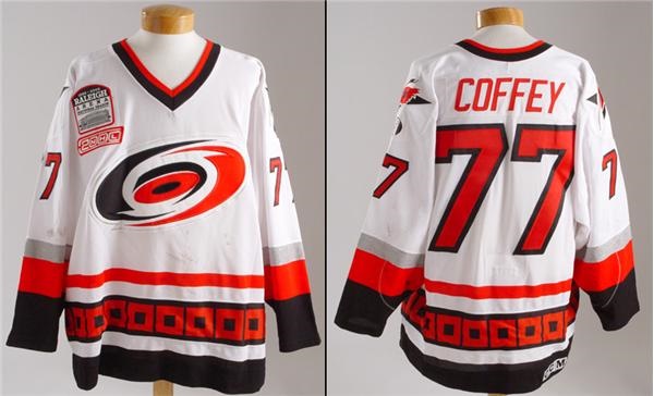
The Whalers were pretty much universally thought to have had one of, if not the best logo and uniforms in the league before they moved, but Carolina has always had some of the absolute worst. I know they gave up their rights to the Whaler IP to the city of Hartford when they moved, but in recent years have had more freedom to do throwbacks and reverse retros. I really think making the Hurricane logo in 90s Whalers colors would work well. Navy blue and green is very nautical, which fits the Hurricane theme, no? I found this concept while googling it, I think it's miles better than anything they've ever worn and would sell a lot better. not sure why they're so hung up on the red and black (yeah technically those are hurricane flag colors from the national weather guidelines or whatever, but who cares?)

avVkbwYY3WPJm67gTmCmb2huNgcS3pPcAvMGWKX06Pg.jpg

The whalers logo will always been one of the greatest. I hate that it’s gone.
 
I like their black 3rds, it was only a matter of time before they made these their primary home uniform. But the real problem they have is the white jerseys--those are putrid, easily the worst 'road' unis in the league. I miss the font/scheme they used when they first moved to Carolina. Loved that angled font/numbers. The current ones are so blah to me. Just bring those white unis back and call it a day.
item_19971_1.jpg
 
There also is not another nhl club that changes their pants between the white and dark jerseys.

So if you’re going with the all black look then shouldn’t they keep the black pants with the white jersey?
 
I know but, how is it you main logo when you've removed it from your jerseys except for a small patch?
I mean the second part of this long heard rumor is that the main logo will be flipping to the flags at some point. Given its our 25th anniversary in NC this year, wouldn't be surprised if its happening maybe next year
 
  • Like
Reactions: DaveG
There also is not another nhl club that changes their pants between the white and dark jerseys.

So if you’re going with the all black look then shouldn’t they keep the black pants with the white jersey?
The rumor is the reason they wore black pants last year in Buffalo was to see if it worked with the flip to the black jersey at home

90


Personally, I don't think it did. In fact, I think its a little too on the nose of the 2002-06 Team Canada look.....

Big-Read-SLC-Oral-History-M-Celebration.jpg


Same rumor said that the reason we wore the black pants at home was to see if the team felt they were salvageable with the home jersey switch. Clearly, they didn't, though I personally think it worked pretty well and helped simplify an otherwise busy waist stripe...

zxxnlzhv48s81.jpg
 
I have never understood what those red things are next to the hockey stick in the logo?

Like others have said, the regular logo would have been better.
 

Users who are viewing this thread

Latest posts

Ad

Ad