
Kranix
Deranged Homer
- Jun 27, 2012
- 18,690
- 16,859
ORANGE you glad he learned something new?I believe you mean PANTONE®, good sir.
New reel, but no new info. Yet.

It's reality. I'm sorry that you don't understand supply chains, but they are real and have to be managed. The same color has to be reproduced exactly across hundreds of different materials from hundreds of different suppliers. That is not a remotely trivial process, it's just one that you take completely for granted since other people are the ones doing the work.
 Are you kidding me?
Ducks posted on their Insta that Wednesday would be the day.just release the dang thing holy sh
this is turning worse than the horrible sabres third jersey release from a few years ago
Looks like they’re trying to convey the “new logo” rising from the depths of some SoCal pierwhat the f*** is this


The Ducks no longer have the worst logo in major Professional sports. I call this a huge win.Well this turned out to be an absolute nothingburger from both clubs.
I don't mind the D, it just always felt like a shoulder patch rather than a primary.The Ducks no longer have the worst logo in major Professional sports. I call this a huge win.
The uniforms the Kings have used since 2011 are low key some of the worst jerseys in NHL history.
If no one cares about exact shades, then what the f*** are you on about again?Yes, it's difficult to get exact shades correct, but that's already the case—and no one cares.
If no one cares about exact shades, then what the f*** are you on about again?
The Flyers don't have a monopoly on orange. Regardless of shade.
No, they wind up with redundant color schemes because there are only so many basic color groups. A red team is a red team, an orange team is an orange team. Nobody is checking color cards to see if the shade of blue is the same for the Leafs and the Rangers, from a fan POV they're the effectively the same color. How many red teams are there with identical shades of red? Both Pittsburgh and Boston use the same shade of yellow, which was the standard "gold" of any sports apparel catalog for decades.I understood your general thinking as "teams end up with completely redundant color schemes because of supply chains!" and my response to that was "hahahahaha what."
This is a billion-dollar business and teams have introduced completely unique primary or accent shades in the very recent past—Seattle's ice blue, Dallas's highlighter green—hell, the Flyers themselves just changed from one shade of orange to another last summer.
Yes, there is variance in the fan merchandise that gets produced for teams and no one cares: you buy it or you don't. But official team branding/on-ice uniforms are not based on access to dyes and fabrics because again, this isn't 1600. We're good to drop this conversation.
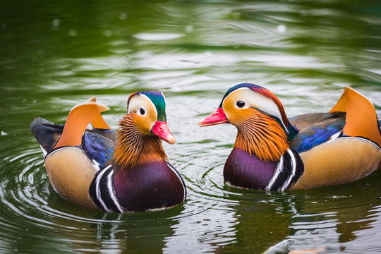
Ducks are neat. The mandarin duck has some pretty crazy colors, including some orange.
That lettering looks niiice.
I’m about to go broke
No, they wind up with redundant color schemes because there are only so many basic color groups. A red team is a red team, an orange team is an orange team. Nobody is checking color cards to see if the shade of blue is the same for the Leafs and the Rangers, from a fan POV they're the effectively the same color. How many red teams are there with identical shades of red? Both Pittsburgh and Boston use the same shade of yellow, which was the standard "gold" of any sports apparel catalog for decades.
If you're not whining incessantly about those, I'd invite you to stop whining about more than one team wearing orange.
Teams often wind up with the precise same shade of blue (or any other color) because there are some industry standard shades that everyone already has in their catalog. It's just easier to go with those shades. The Flyers switched between what would often be labeled as "bright orange" to "burnt orange", both established colors. They didn't go in and pick a custom hex code.
Of course custom shades can exist for expensive items like jerseys (and you can print graphics in any color as well), but they're extremely limiting- see if you can find any neon green tee shirts for Dallas. Lots of stuff in their standard green, because it can readily be found in any sports apparel catalog. BTW, the Kraken Ice Blue is NOT a non-standard shade. Not a frequently used one in the NHL, but it's readily available. Here, buy a tee shirt. A bunch are offered from different manufacturers.
I would urge you to consider that you might be being slightly irrational and contradicting yourself here.
I never noticed the Buffaslug had eyes until just now.With the Ducks going to orangey eyes, I’m seeing a pattern of rabid or insomniac animal crests in the NHL.
View attachment 886366
I always thought it was just Donald Trump's hair.I never noticed the Buffaslug had eyes until just now.
This is certainly fine.

