
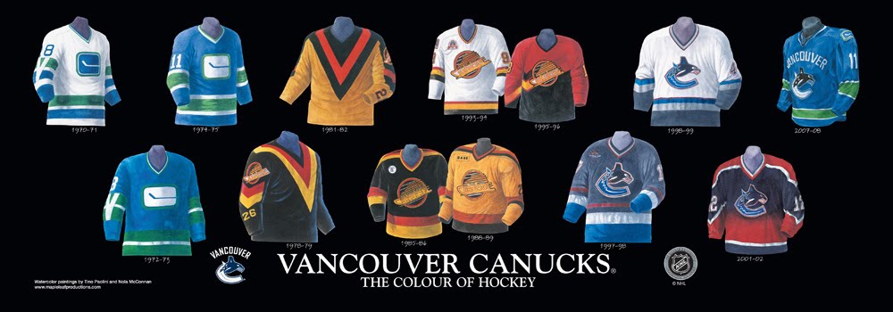
Canucks Bringing Back the 'Flying Skate' Sweaters
- Thread starter Ziggy Stardust
- Start date
You are using an out of date browser. It may not display this or other websites correctly.
You should upgrade or use an alternative browser.
You should upgrade or use an alternative browser.


NYR94
Registered User
Oh god, the spaghetti plate jersey is atrocious. Yah, I get there's nostalgia and some good memories there, but it's straight up ugly. I couldn't even tell it was a skate until I was like 17, and the Halloween colour scheme is so wacky.
The millionaires jerseys are way slicker. Or wear the original stick-in-rink kits for promotional nights.
Just not the spaghetti plate.
The millionaires jerseys are way slicker. Or wear the original stick-in-rink kits for promotional nights.
Just not the spaghetti plate.
I am not exposed
Registered User
I’m sure everyone thought the logo is a nod to one of the best rock albums of all time.

Hell yeah!
Love Judas Priest. Great album.

PeoriaBlues309
Registered User
lawrence
Registered User
- May 19, 2012
- 16,270
- 8,184
What exactly is a "Canuck" anyways?
is a slang for a Canadian. Used during the 40's and 50's I believe. It's like Canadas equivalent of a Yankee,
Slang for Americans is a (yankee) Slang for a Canadians is a (canuck) its our equivalent
So are they wearing these just in 19-20 or this coming season as well?
19-20 season for selected games.
lawrence
Registered User
- May 19, 2012
- 16,270
- 8,184
I feel like I’m the only person who doesn’t like these. The arena logo jerseys have always been my favourite
actually 30% of the voters didn't want the black skate, so no, your not special many others hate it too.
brokenhole
Registered User
- Aug 12, 2015
- 1,135
- 408
You don't get a lot of things.I dont get it, i find it disgusting
brokenhole
Registered User
- Aug 12, 2015
- 1,135
- 408
The Millionairs sweaters are ok except the see through pants. Eddie Lacks skidmark is something that you cant unsee and will haunt you for the rest of your life.Oh god, the spaghetti plate jersey is atrocious. Yah, I get there's nostalgia and some good memories there, but it's straight up ugly. I couldn't even tell it was a skate until I was like 17, and the Halloween colour scheme is so wacky.
The millionaires jerseys are way slicker. Or wear the original stick-in-rink kits for promotional nights.
Just not the spaghetti plate.
Chuck Norris Trophy
Registered User
- Jan 22, 2015
- 2,827
- 3,515
One of the greatest jerseys of all time, takes me straight to my childhood . 1994 SCF and The Russian Rocket never forget.
Beville
#ForTheBoys
Do we know which uniform this will be?
All we need now is the V uniform (or whatever you call it).
All we need now is the V uniform (or whatever you call it).
What's funny is that I never realized it was a skate until they were long gone and I was an adult.
:embarassed:
I didn't even realize they were a flying skate until I saw this thread title, how about that?
I started watching hockey in 2001 and never really saw them though.
tony d
Registered User
Eat The Rich
Registered User
- Jun 17, 2017
- 1,540
- 1,784
Their "subtlety" with more recent jerseys did prompt this:

It is kinda funny how they've always historically had hidden elements in their uniforms. The Sleeve V, Stick in rink, flying skate..
And then they come out with the VANCOUVER jerseys.
Maybe they were hoping people wouldn't notice.

Super Hans
Stats Evangelist
- Oct 9, 2016
- 4,623
- 12,753
I also heard they're replacing the video screens to 30 ft. CRT screens and the arena DJ is going to play nothing but disco on vinyl.
Addison Rae
Registered User
What an overall horrible opinion, Anaheim completely shit the bed with their new Mighty Ducks scheme.At least Anaheim took a chance at being creative. This is just lazy on the Canucks’ part.
The jersey still looks really outdated to me. The logo is putrid.
Calling the flying skate logo “putrid” is absolutely hilarious. The Canucks wore this jersey in 2016 against Toronto and it surely didn’t look “outdated”.
Pens x
Registered User
- Oct 8, 2016
- 16,274
- 8,314
People only like this because of the whole nostalgia thing. If this was a totally new sweater people would critizing it. What is that logo!? It would be shredded to no end here.What an overall horrible opinion, Anaheim completely **** the bed with their new Mighty Ducks scheme.
Calling the flying skate logo “putrid” is absolutely hilarious. The Canucks wore this jersey in 2016 against Toronto and it surely didn’t look “outdated”.
Most people would love literally any jersey previously worn by a team on this site strictly for nostalgic reasons.
CascadiaPuck
Proud Canucks investor.
I don't hate the spaghetti plate/flying skate, but I do feel strongly that the team needs to stay committed to a color scheme at this point. I mean...
^And that's without the maroon Millionaires jersey option.
I say bring it all up to Cascadian blues and greens and be done with it.


(Credits at this link)
Maybe that Millionaire's one is a bit suspect (though the "V" done in blue with white lettering as a patch was sweet when it was used a few years back).
If I could pick, I would convert everything to blues/greens. You could have something like the stick in rink as the primary jersey logo (with the orca C as a shoulder patch), and you could have the spaghetti plate as the 3rd (with the blue Vancouver Millionaire V as the shoulder patch).
Abler souls than me could pick out the best placements for the various historical symbols. Just limit the darn palette and put some distance between the technicolor yawn that is the history of coloring for this franchise's gear.
^And that's without the maroon Millionaires jersey option.
I say bring it all up to Cascadian blues and greens and be done with it.
(Credits at this link)
Maybe that Millionaire's one is a bit suspect (though the "V" done in blue with white lettering as a patch was sweet when it was used a few years back).
If I could pick, I would convert everything to blues/greens. You could have something like the stick in rink as the primary jersey logo (with the orca C as a shoulder patch), and you could have the spaghetti plate as the 3rd (with the blue Vancouver Millionaire V as the shoulder patch).
Abler souls than me could pick out the best placements for the various historical symbols. Just limit the darn palette and put some distance between the technicolor yawn that is the history of coloring for this franchise's gear.
crazychimp
Registered User
I always enjoyed these they should have always been our 3rd jerseys, however they need to go back to their roots and forget about that weird looking whale and go back to the originals!


- Oct 9, 2012
- 27,359
- 36,967
Second best jersey next to the throw back millionaires jersey (how can you not like the Stanley cup winning jersey the best!)
end
Registered User
I hate how every pacific northwest team wants to wear green and blue. WE GET IT THERE'S TREES AND RAIN DO ANYTHING ELSE
also bring back long pants. the classy way to play hockey.
also bring back long pants. the classy way to play hockey.
MarkusKetterer
Shoulda got one game in

Users who are viewing this thread
Total: 1 (members: 0, guests: 1)
Latest posts
-
 Canucks & NHL News, Rumours, and & Fantasy GM | Getting to the Centre Of It All (49 Viewers)
- Latest: Vector
-
 Salary Cap: 24-25 Salary Thread Crosbicles Volume MXVII: Marner Watch (45 Viewers)
- Latest: Big Friggin Dummy
-

-

-
