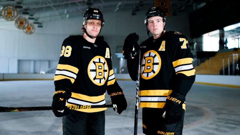
Confirmed with Link: - Bruins Unveil New Unis | Page 5 | HFBoards - NHL Message Board and Forum for National Hockey League

Confirmed with Link: Bruins Unveil New Unis

RIP, modernized standing bear.

It was a decent modernization of the old standing bear.

And these alternates were a blessing and a curse as they brought back the V neck and single outlined numbers, but the damned black socks.

1750874233387.jpeg
 
Come onnnnn!

View attachment 1055107

JK! To each, their own!
That doesn't look odd to you? Like, it's supposed to be a dark uniform. The gold socks are light. There's a reason they keep choosing to not bring them back. It's out of balance.

Like you said, to each their own. Or as my dad would say, 'opinions are like assholes, everybody has one and they all stink.'
 
  • Like
Reactions: BMC
That doesn't look odd to you? Like, it's supposed to be a dark uniform. The gold socks are light. Just doesn't look right IMO. Out of balance.

Like you said, to each their own. Or as my dad would say, 'opinions are like assholes, everybody has one and they all stink.'
My old man hated the red patriots pants with the white tops.

“Santa Claus uniforms”

The black socks are more symmetrical than the gold, but I love the gold. Black makes them look like the Penguins.

I really envy the people on Facebook who claim they “look the same” and “can’t see the difference”.

I hate that I obsess over this shit.
Yeah, I hear you about the Penguins. I always hated that they copied our color scheme. I mean, there are infinite colors available and you choose ours? And what does black and gold have to do with a Penguin? I really hoped they were going to go to a light blue/dark blue scheme like their first Winter Classic jerseys.

I think it's cool that you're into this. There are far worse things to obsess over.
 
That doesn't look odd to you? Like, it's supposed to be a dark uniform. The gold socks are light. There's a reason they keep choosing to not bring them back. It's out of balance.

Like you said, to each their own. Or as my dad would say, 'opinions are like assholes, everybody has one and they all stink.'
There's a reason why they had them for 70 years too, contrast and balance. For most NHL teams the pants provide that contrast, a black jersey and black pants leaves the socks. A dark color head to toe with only accents breaking it up might be trendy but it isn't visually interesting, contrast is timeless. The Patriots look better with blue jerseys and white/silver pants, or white/silver jerseys with blue pants, all blue or all silver doesn't look good.
 
There's a reason why they had them for 70 years too, contrast and balance. For most NHL teams the pants provide that contrast, a black jersey and black pants leaves the socks. A dark color head to toe with only accents breaking it up might be trendy but it isn't visually interesting, contrast is timeless. The Patriots look better with blue jerseys and white/silver pants, or white/silver jerseys with blue pants, all blue or all silver doesn't look good.
I think the accents provide the contrast; stripes/color at the shoulders, the elbows, the waist and the socks. Teams that have a dark jersey generally don't go with bright socks.
 
I think the accents provide the contrast; stripes/color at the shoulders, the elbows, the waist and the socks. Teams that have a dark jersey generally don't go with bright socks.
They do it with the pants, the Rangers, Montreal, and Chicago have matching jerseys and socks but contrasting pants. Other teams have more contrast through larger stripes, shoulder yokes, or sleeves. By using the socks the Bruins achieved a traditional look in a way that was unique to them, and the 80s jersey was designed for that. I don't think it works as well without it.
 
My all-time favorite Bruins uniform hales from the Big Bad Bruins era.

These are very cool too.

I like 'em, and hopefully, they signal both a reclamation of traditional Bruins DNA as well as looking to a (potentially) bright future,


Only thing I'm iffy on is the black cuffs on the whites, but I know that's been a staple on all their whites for a long time now. Other than that, these jerseys are just about perfect and I'd be a-okay with these for decades to come.
 
RIP, modernized standing bear.

It was a decent modernization of the old standing bear.

And these alternates were a blessing and a curse as they brought back the V neck and single outlined numbers, but the damned black socks.

View attachment 1055109
Those are my near favorite third jerseys, at least they were third jerseys when they introduce them.
 
  • Like
Reactions: TP70BruinsCup
I'm not a big uniforms guy, but these are certainly very nice. Could maybe ask for a yellow collar, still miss the yellow socks, and I like jersey laces, but those are increasingly rare. But no real complaints. Good, clean look, easy on the eye, blends elements of a few different jerseys from years' past.

Not racing out to buy one, but if I were to get a new top at some point I'd happily wear one of these.
I like it so much better without the collar. But I would have loved to keep the tie.

Other than that? No notes. Love em.
 
I'm not a big uniforms guy, but these are certainly very nice. Could maybe ask for a yellow collar, still miss the yellow socks, and I like jersey laces, but those are increasingly rare. But no real complaints. Good, clean look, easy on the eye, blends elements of a few different jerseys from years' past.

Not racing out to buy one, but if I were to get a new top at some point I'd happily wear one of these.
@Aussie Bruin The black sweater was driven by television as the home gold sweater looked white on black and white TV

 
Last edited:
  • Like
Reactions: Aussie Bruin

Users who are viewing this thread

Ad

Ad