
ACLEVERNAME
Registered User
- Jan 6, 2010
- 6,850
- 5,526
Already have a Silfverberg and Filatov jersey for thatYou have to respect the legacy of failed projects and cup of coffee players. Imagine seeing someone at the CTC in a David Legwand jersey. 10 years from now, that could be you with your Debrincat jersey at the Shawarma Palace Lebreton Plaza.
Daaaamn, that is a nice hoodie!
I'd buy one but they don't even let you order online without a membership.
Lol, legit concerns.I would just buy you one with my membership but I can't have my posts about Cody Ceci traced back to my real life persona.
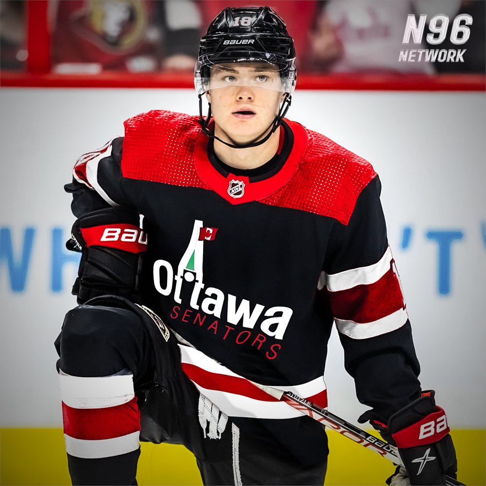
I don’t think they’ll ever create a jersey as nice as the current home and away that was are using right now!
Obviously very subjective, but i love our uniforms!!
I don’t like the swoosh,They are very nice jerseys, but I don't think they are unique enough to Ottawa.
The away should have been the same as the original away with the black forearms. They had that jersey for 20 or so years originally. It seems like a small thing, but if you take the crest off the current white jersey, it could be any generic hockey jersey - but once you add the black forearms it becomes a Senators jersey, even without the crest.
Aesthetically, I like the black home jersey better than the black Reverse Retro, but I would argue that the black reverse retro is a better jersey. Again, it comes down to what my philosophy is about marketing and identity with hockey jerseys. The swoosh is a unique design element. In terms of overall look, they are both very similar, being a black jersey with one tone of striping - but the Reverse Retro is without a doubt a Senators jersey.
I am also a big fan of the proprietary font on the Reverse Retro jerseys. I would be interested to see how that font would fit on the current home and away jerseys.
Not a fan of those coloursView attachment 906047View attachment 906048
Rough job, but there it is with black forearms instead of white.
View attachment 906049View attachment 906050
No forearms, which is closer to our current look.
I think that it looks more like how a Senators jersey should look with the forearms. No forearms is too close to the Ottawa Dallas Stars, and our women's team has already left us for the Tampa Bay Lightning.
Not a fan of that old word mark logo. Looks like a plumbing company from Orleans 1988.
Should be better use of the tower in a more traditional roundelle of some sort and less type. Think of that Craig Anderson black helmet with gold tower on the forehead

Sens don’t own the rights to that logo, and are unwilling to pay for it based on the demands of who does.
Yeah it's not a great logo and wasnt even great when it was originally unveiled. I think fans in 2024 are more design savvy than that and as it was never really used, there's no real connection to it other than for the 10k people that remember it.That is part of the appeal. There are rabid fans who pay through the nose for the Peace Tower logo merch.
It's a very dated logo. The best way to bring it back would be as a limited one-time use jersey. The moment it's brought back as a full time thing, nobody will care about it. The appeal of it is the era it comes from, and that merch with the Peace Tower logo is a status symbol that says not only did I spend $150 on this stupid mesh shirt, I also am in the (not so) secret club of people who know what the logo was before the team existed.
They did a remake of the Peace Tower logo, and regardless of whether it is a better or worse interpretation, a remake ignores the appeal of the logo. There is an emotional attachment to the idea of what the logo says about the fan who has merch with it.
There is a concept someone made with the updated logo.
Here is a concept of the original logo/jersey template on an Adidas uniform.
The new one looks better and more modern, but changing it ignores what the actual appeal of the logo is. Which is that it's a really limited thing, that if you have it says you like the Senators enough to own something nearly impossible to find, that a lot of people don't know even exists (I think most people know about it, but the perception has always been that the Senators having a different logo for a year or two is a "Did you know?" type fact).
I don’t think so, if he did I am sure they would work something out.Does Bruce Firestone own it?
