GDT: 2024-25 NCAA Frozen Four Thread

Who is going to win the 2025 National Title?

  • Boston College Eagles

    Votes: 7 14.0%
  • Boston University Terriers

    Votes: 14 28.0%
  • Connecticut University Huskies

    Votes: 1 2.0%
  • Cornell University Big Red

    Votes: 2 4.0%
  • Denver University Pioneers

    Votes: 12 24.0%
  • Maine University Black Bears

    Votes: 1 2.0%
  • Massachusetts University Minutemen

    Votes: 1 2.0%
  • Penn State University Nitty Lions

    Votes: 2 4.0%
  • Western Michigan University Broncos

    Votes: 10 20.0%

  • Total voters
    50
  • Poll closed .
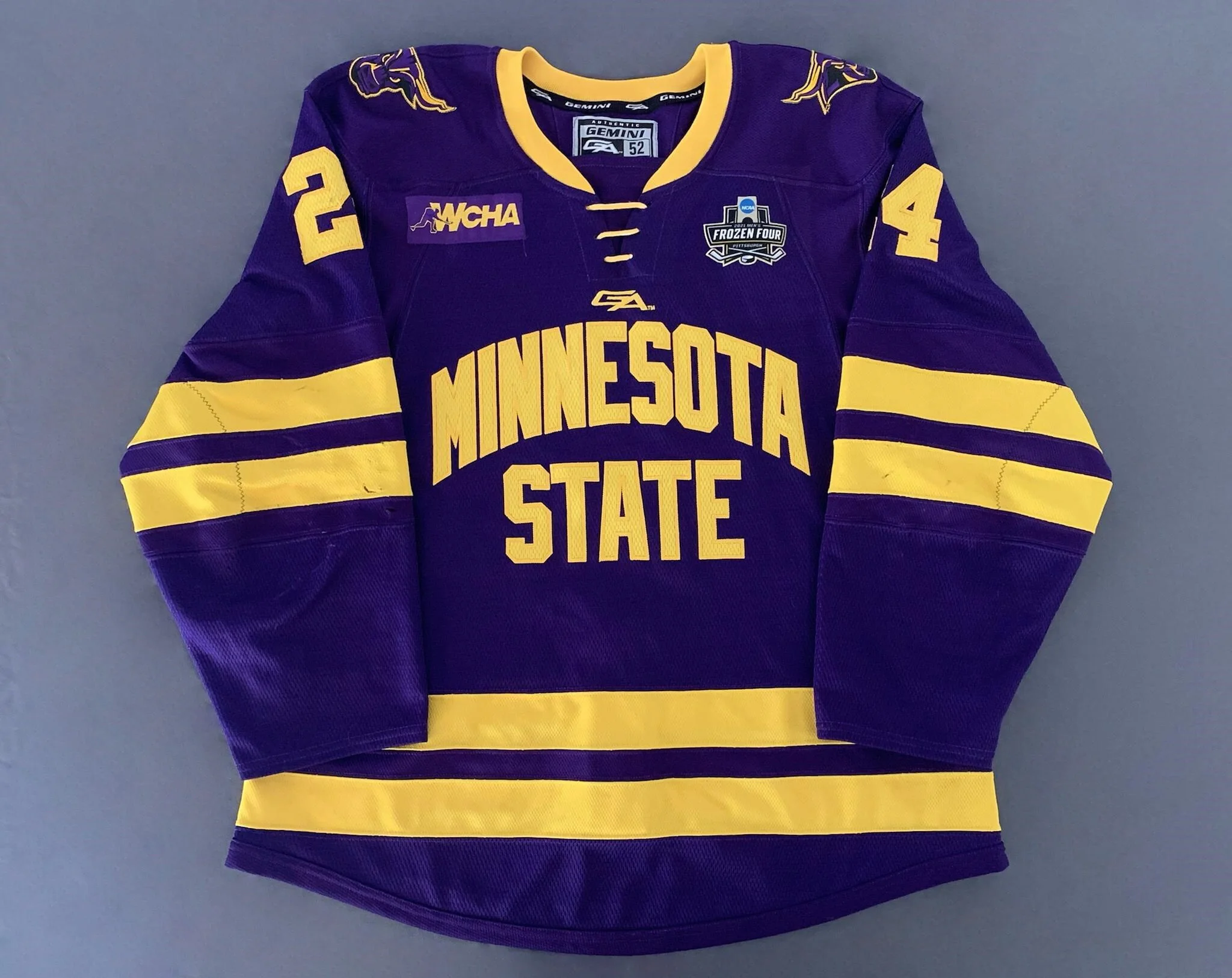
Why you say that? I just googled and it looks pretty clean TBH with nice shoulder patches. BU's jerseys look like pajamas with the most unnecessary word mark in the history of sports. You really need to put the entire "title" of the school with absolutely nothing else?

Marketing-wise, BU is also the worst. If you look at all the legendary logos in sports, they are logos that do not need any explaining (Cowboys, Blackhawks, Canadiens, Yankees, Red Wings, Red Sox, Barcelona FC, etc. - none of them have word marks in them). Penn State doesn't need to say "Penn State" on their jersey because everyone knows who they are. One way you do this is by keeping a logo for a long time (like 50+ years) and marketing your school. BU is a big-name school, both in terms of academics and sports. Maybe not nation-wise like Penn State is, but definitely in the NE-region it is, and that is one of the heavily populated places of the entire USA. My argument is that BU is big enough that you don't need a jersey that says "Boston University" on its front with one stripe. It's like Under Armour and the school did a 15-minute brain session with contributing zero effort into it.

So by that same logic you would hate Boston College by the same
 
So by that same logic you would hate Boston College by the same
I don't dislike all wordmark jerseys when they are done right, Denver's is solid, Western Michigan is smooth, and Maine/Michigan State are wonderful. My problem is that MOST teams just copy and paste the same design from their basketball or throwball kits onto their hockey sweaters. Most colleges have brilliant logos and they just go with the curved wordmarks with numbers underneath for some reason (just look at every hockey jersey in the ECAC except Quinnipiac). I don't necessarily hate BC because they have at least one jersey that has their old school Eagle logo (plus the slant New York Rangers jersey isn't too horrible). However, Minnesota State and Arizona State are some of the biggest criminals. They purposely went from great logo jerseys to these monstrosities:

1+%282%29.jpg

arizona-state-sun-devils-2024-25-away-jersey.jpg


Like the scoreboard and the PxP will mention a million times which teams are playing, we don't need a jersey that has the school's name to solidify that for the average viewer lol. Arizona State has one of the most recognisable and unique logos of any college (up there with Penn State), they never needed to rebrand themselves to show the other school who they are playing against like an uncreative walking billboard.
 
  • Like
Reactions: Summer Rose

Users who are viewing this thread

Ad

Ad