
joe galiba
Registered User
- Apr 16, 2020
- 1,882
- 2,937
I know, I was looking at it he has played more games than guys like Oshie, Ramage, Shattenkirk, Gilmour, Polack, Meagher, Babych, Baron, Chase, both Cavallini’sGet outta here. Thomas has only been in the league for... 7 seasons... f*** im old now.
he is 25th in games played now and he is going to pass Bou, Demitra, and Red next year


:upscale()/2015/11/19/993/n/1922283/8757e583f9eb7645_635721436436930168-1860293760_dont_screw_it_up.gif)


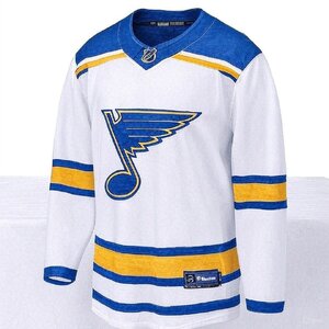

") . Your point about background driving color choices...really hoping we're careful with the yellow, too. By most accounts, this has been in the works for 3 years, so the runway to get this right has been plenty long.
. Your point about background driving color choices...really hoping we're careful with the yellow, too. By most accounts, this has been in the works for 3 years, so the runway to get this right has been plenty long.