2024-2025 Blues Multi-Purpose Thread.

I actually like blues a bit as a Flyers fan and god I love your prospect pool. Things look bright for you guys:

Dvorsky, Pekarcik, Stancl, Jecho, Kaskimäki, Snuggerud, Jiricek (if he can stay healthy), Lindstein. I mean that's a damn good crop of prospects.

I would suggest your franchise drafting some goalie prospects as well to replace Binnington in the future. Rimpinen wouldn't be wild in the second or third round.

Other notable goalies later on could be Andreyanov, Frolov, Feldbergs, Medvedev.
 
Last edited:
I've just never been a fan of the navy blue. It's a big reason I prefer our current away jerseys over the home jerseys, there's just that much less navy blue on the whites. So anything that cuts down on the navy Blue I'm likely going to be a fan of.

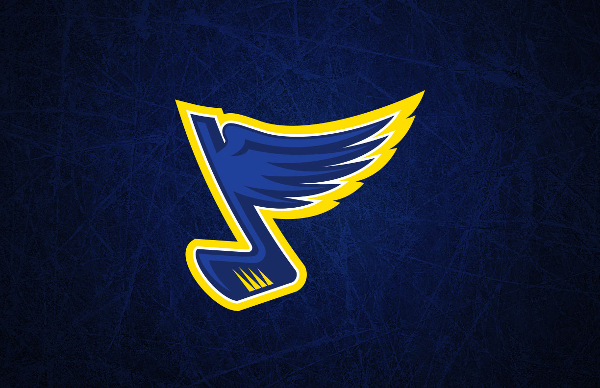
Also, I've always preferred the skinnier logo over the current one. It's hard for me to explain why. With the current logo, it comes across as more of "just a shape." This might not make sense, but I don't know how else to put it into words. With the skinny version, it's like the musical note and the wing are more visibly unique from one another. With the current version, it's like they blend together too much and become more of a single shape. I prefer the wing and the Note to be more separated but still a unit. The Note becomes more pronounced, the wing becomes more pronounced, and I think that makes the logo as a whole look like a more pronounced winged Note.

I don't know if that makes sense.
 
Also, while looking at different versions of the Note, I came across this monstrosity, so now you have to see it too.

NHL2016_blues_primary.jpg
 
Significantly better than this monstrosity that Harry Ornest nixed.
 

Attachments

  • 1746913323062.png
    1746913323062.png
    1.5 MB · Views: 1
Last edited:
Has more of an aggressive look than the heritage - which I think is what you’re describing @HighNote . Doesn’t belong on current layout. Glad this is happening with the team on the rise - should be good for the organization from the business side.

View attachment 1033174
I like it. Way more aggressive with the “feathers” tailing off like the point of a bayonet.
 
  • Like
Reactions: taylord22
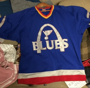
I'm all for a rebrand, but I don't want to rehash more heritage gear and call it "new" which is what LA basically did with their chevy logos. I'm going to be genuinely annoyed if the cream is brought back as a primary color. If I had to guess, over 90% of this fanbase can't really relate to the 1960-70's Blues and bringing that era back would be really out of touch from a marketing standpoint.
 
Has more of an aggressive look than the heritage - which I think is what you’re describing @HighNote . Doesn’t belong on current layout. Glad this is happening with the team on the rise - should be good for the organization from the business side.

View attachment 1033174
I must be the only one that doesn’t like the new logo.
 
I actually like blues a bit as a Flyers fan and god I love your prospect pool. Things look bright for you guys:

Dvorsky, Pekarcik, Stancl, Jecho, Kaskimäki, Snuggerud, Jiricek (if he can stay healthy), Lindstein. I mean that's a damn good crop of prospects.

I would suggest your franchise drafting some goalie prospects as well to replace Binnington in the future. Rimpinen wouldn't be wild in the second or third round.

Other notable goalies later on could be Andreyanov, Frolov, Feldbergs, Medvedev.

There’s also 2 D man that I’m really high on… Ralph and Fischer. Both will have long NHL careers.
 
Last edited:
I'm all for a rebrand, but I don't want to rehash more heritage gear and call it "new" which is what LA basically did with their chevy logos. I'm going to be genuinely annoyed if the cream is brought back as a primary color. If I had to guess, over 90% of this fanbase can't really relate to the 1960-70's Blues and bringing that era back would be really out of touch from a marketing standpoint.
I’m with you. I really don’t like the “heritage” color scheme. I can’t tell if we’re just altering the logo or making the powder blues our new uni’s altogether or both. Whatever. It’s an easy cash grab for owners to sell new merch but I’m not a fan if these become our regulars.
 
  • Like
Reactions: BlueMed
Looks like the rebrand on the note is keeping the same modern colors, but adjusting the style. I think that would be a smart decision business wise, that way you still have the heritage jerseys as a special event thing, and we have more a a heritage inspired, but modern main set.
 
I was just screwing around with a jersey editor for fun, what do you guys think about these? Ignore the logos for the most part, the sizing is a little wonky and I couldn't find the logo that is on the home jersey with the powder blue color, and I'm too lazy to go in and edit the home one.


View attachment 1033839View attachment 1033840
I love the white ones. A lot. Well done!
 
  • Like
Reactions: HighNote

Users who are viewing this thread

Ad

Ad