Speculation: 2020-21 News/Rumors/Roster Thread Part II

  • Work is still on-going to rebuild the site styling and features. Please report any issues you may experience so we can look into it. Click Here for Updates
Status
Not open for further replies.
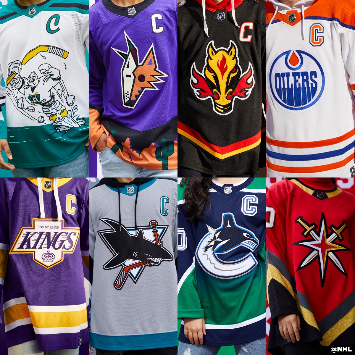
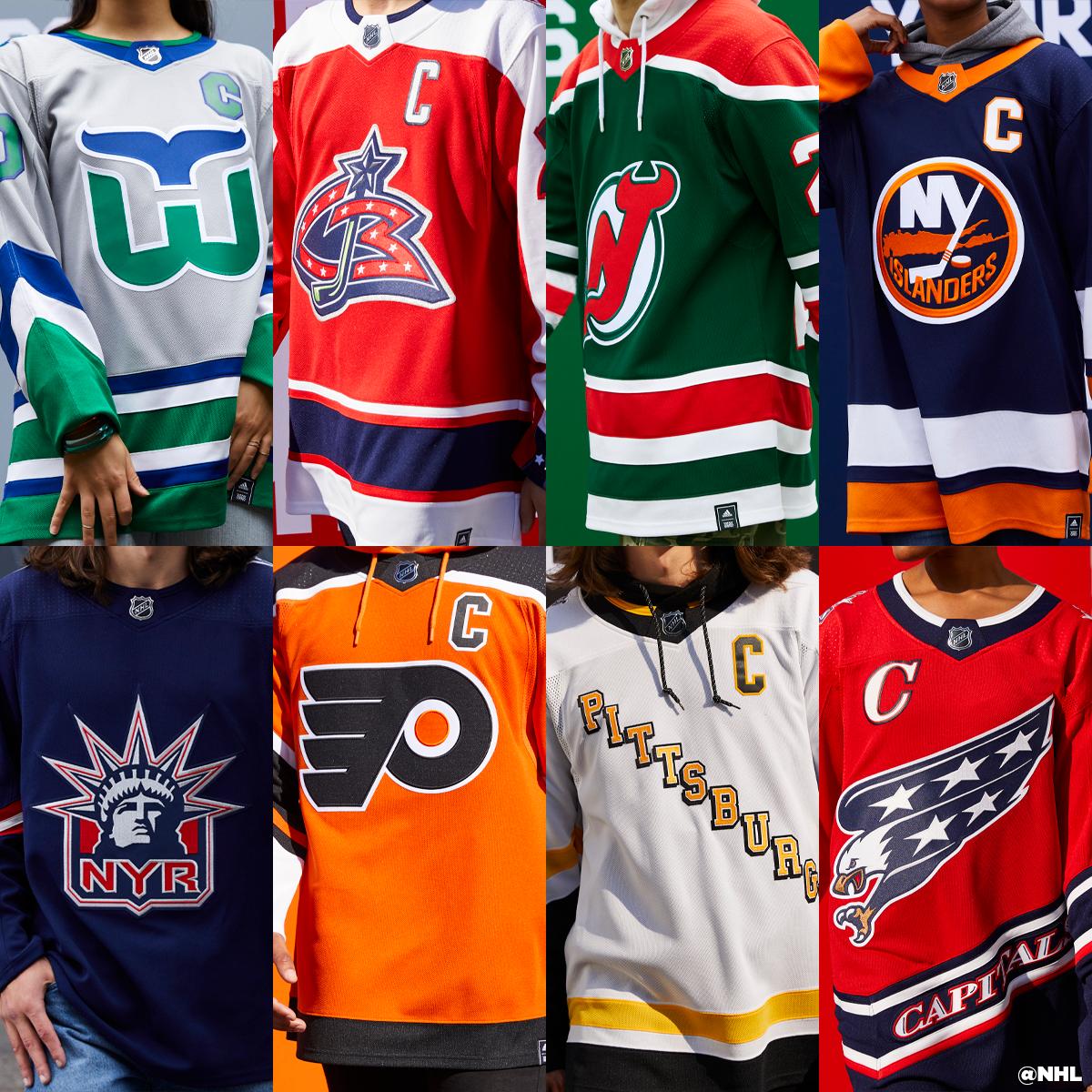
I think the Kings one is good and I'll be tempted to pick one up, but I would have been very cool with a purple/gold Burger King.

Ducks have already worn the old jersey recently. They could have changed the colors but I think it is cool they went with the clown jersey. Would have been great to have the Kings wear a Burger King one and play the Ducks with that cartoon jersey.
 
  • Like
Reactions: Rumpelstiltskin
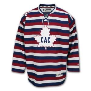
Is it this Habs gem? ;)

1912-13.jpg

Weren't these used in Quebec Provincial prisons many years ago?
 
  • Like
Reactions: Token
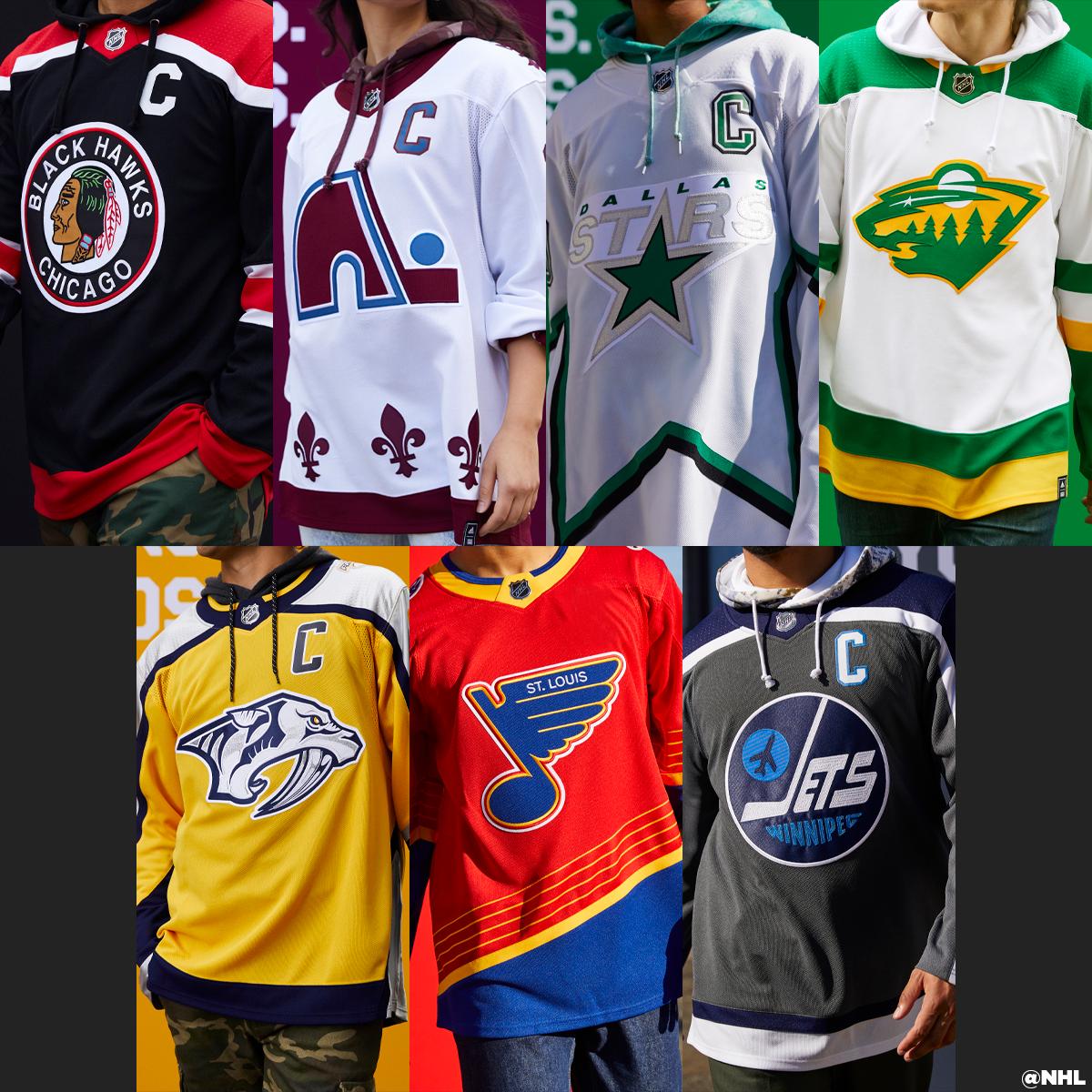
I think the Winnipeg one is one of the worst. Everyone has nice bright colors and then that muted abomination.

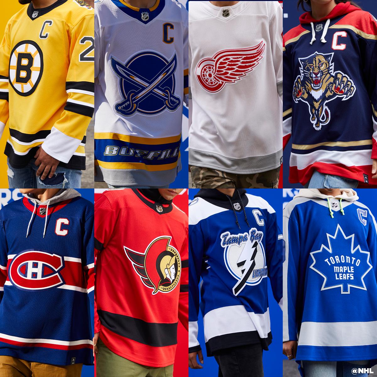
The Wings look like they did theirs in protest - “f*** it, throw some grey stripes in, who gives a shit”
 
  • Like
Reactions: mbar
Ducks ran into a problem where they basically already did a reverse retro last year with this.

thumb.aspx


So I think they were in a tough spot trying to come up with something new.

Red Wings on the other hand what the f*** were you guys thinking
 
  • Like
Reactions: BringTheReign
Is it this Habs gem? ;)

1912-13.jpg
LOL I may be the only person in the world who liked the Habs pajama jerseys :laugh:

Re: the new Kings design, I really like it. Everyone always likes when they bring back some version of the purple and gold but I doubt they ever go back to them permanently. I think people kind of forget that they weren't very popular at the time they were originally worn, one of the reasons everyone went bananas for the Gretzky era change. The purple and gold's are fun occasionally but I think people would tire of them if they wore them full time. The players prefer the black sweaters and we won 2 Cups wearing them. I doubt we change them dramatically again.
 
  • Like
Reactions: VILARGOD and Token
NHL trying to defer an additional 13% from players salary for 20/21.

This would make payroll at 62% of contract value with 23% paid out over three years, no interest.

NHL, NHLPA take first step in addressing issues with 2020-21 salaries

As the NHL and NHLPA began grinding away at the 2020-21 NHL schedule, both sides knew at some point there would be a conversation about salaries. In last summer’s collective bargaining agreement, the players agreed to collect 72 per cent of their gross pay for the upcoming season — a 10 per cent deferment, and 20 per cent escrow. In their eyes, that was the deal, whether they played one game or 82.

I wonder who told the players that would be the deal, whether they played one game or 82, ...because I have a bridge.
 

Most of these Retro reverse jerseys are not that bad actually. But all I know is the 3 worst in no particular order for me has got to be the Wings, Yotes and the obvious Ducks. LOL those practice jerseys the Wings came up with are hilarious. The Yotes apparently think putting an Opossums head in front of their jersey would be a good idea. :laugh: And of course the ducks will be the Ducks. Wild Wing needs to get shoved back into that ice, man that's just brutal. Also, a big honorable mention goes to the Islanders thanks for bringing your regular jerseys to the game. Too funny. :facepalm:
 
I kind of feel bad for Ducks fans to be honest. A lot of teams got some pretty solid throwbacks, and while it fits the spirit of the "fun" 90's throwback, obviously that design is almost laughable trash. I think if they were going to go back to the 90's then they should have just re-designed their original design:

Paul-Kariya-Ducks-2003.jpg

This is just straight up one the best jerseys of all time.
 
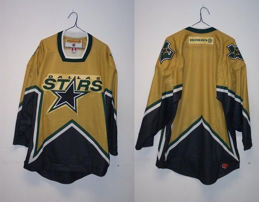
How did Dallas f*** up something so simple? Their old star was one of the best jerseys ever.

d117848ccc5be3d8.jpg
agreed, why not do a black of this jersey? Guessing the league needed another white jersey out there but man Dallas struggles with special jerseys. This template itself was a rip off of the allstar game so they are unoriginal. Their current jerseys are just chicago's st. patricks day jersey, they have the mooturus and the STDers jerseys asa well.
 
Winnipeg should have used the 90's version of the sweater (Tkachuk/Selanne years) and simply flipped the blue and red so red was the primary, unless they wanted to do a nod to the Thrashers colors and figure something out there.

They've already worn throwbacks with this older version of the logo so it would have been nice to see the 90's one. Let's face it: a big push of this campaign is 90s nostalgia so to use the older logo again is lame, never mind the drabness of the color scheme. I think the 90's logo is better anyways with the jet flying across the team name and the hockey-stick-J doubling as part of one of the Ns in Winnipeg.
 
agreed, why not do a black of this jersey? Guessing the league needed another white jersey out there but man Dallas struggles with special jerseys. This template itself was a rip off of the allstar game so they are unoriginal. Their current jerseys are just chicago's st. patricks day jersey, they have the mooturus and the STDers jerseys asa well.

Or the rejected gold jersey that was never used.
CiqjlTRU4AAtZbB
 
  • Like
Reactions: YP44
Status
Not open for further replies.

Ad

Upcoming events

Ad