Rumor: New Third Jersey

  • PLEASE check any bookmark on all devices. IF you see a link pointing to mandatory.com DELETE it Please use this URL https://forums.hfboards.com/

Mr Misunderstood

Loser Point User
Apr 11, 2016
10,219
11,223
Charlotte, NC
Always remember, there are more important things than jerseys or logos.

islanders-milbury-1.jpg


upload_2018-5-29_15-54-28.png
 
  • Like
Reactions: doublechili

PK Cronin

Bailey Fan Club Prez
Feb 11, 2013
34,503
23,941
No way that's uglier than the pajama jersey they had when the sweaters first went Reebok Edge. Or, that black/grey/blue/orange abomination with the ISLANDERS written across the chest like a 193os football uniform.

Completely forgot about those black and grey ones! You right.
 

Axe Man

Registered User
Sponsor
Jul 31, 2009
1,288
332
Nearby
I am pretty sure the Islanders will win the cup before they ever come up with a respectable 3rd jersey.
 

On Edge

Registered User
Nov 26, 2005
2,743
122
Long Island
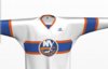
What do you think of these...just having a little fun!
 

Attachments

  • AFADE075-77ED-41FE-A26F-5B2980203944.jpeg
    AFADE075-77ED-41FE-A26F-5B2980203944.jpeg
    579.5 KB · Views: 20
  • CE48B35B-4954-4038-9826-D919ABF133B8.jpeg
    CE48B35B-4954-4038-9826-D919ABF133B8.jpeg
    108.8 KB · Views: 19
  • AFF77986-E773-446A-921E-51AA52F443B0.jpeg
    AFF77986-E773-446A-921E-51AA52F443B0.jpeg
    468.5 KB · Views: 17
  • 46798BF5-54DC-44E2-9356-625A7E9A04FB.jpeg
    46798BF5-54DC-44E2-9356-625A7E9A04FB.jpeg
    116.4 KB · Views: 16
  • 83DAAE2C-B030-43DE-B1AF-7D7AFE8E125B.jpeg
    83DAAE2C-B030-43DE-B1AF-7D7AFE8E125B.jpeg
    133.6 KB · Views: 18
  • DAA965DD-98F6-4F83-B75D-7D42DF7FFB79.jpeg
    DAA965DD-98F6-4F83-B75D-7D42DF7FFB79.jpeg
    110.8 KB · Views: 18

Mkdaman1818

Registered User
Jun 29, 2013
1,433
477
The Hockey Guy just posted this video a couple days ago and he is adamant that the islanders are going back to the fisherman jersey. Lord help us if they do...


LeapOnOver

Mackenzie is a hack!
Jan 23, 2011
12,578
3,752
Iksan, S. Korea
www.leaponover.com
I think that's the ugliest jersey they ever put out. I know I'm the only one. Also, I loved the black and white. Still disappointed they never came out with the hat I wanted.

I'm disappointed about the hat, but I definitely disagree about the stadium jersey. I still have my Nielsen one and it's actually my favorite jersey. In pictures the silver looks and stands out, but wearing it it's not nearly as noticeable. The only thing I don't like about it is that as I've gained weight getting old the bottom of the Y kind of points out from my ever expanding beer belly. Not that a hockey jersey has ever been flattering to wear, but it's the an arrow saying, "look at this monstrosity!".
 
  • Like
Reactions: PK Cronin

Mkdaman1818

Registered User
Jun 29, 2013
1,433
477
How credible is The Hockey Guy, because I am 110% the outlier that will buy a fisherman based third.
He’s usually just an outsider who comments on the game but he claims to have knowledge this time which is odd. Time will tell I guess, but he’s not a rumor whore like Eklund
 
  • Like
Reactions: IslandersFan17

The Lighthouse

Registered User
Aug 1, 2011
2,860
2,379
I think a return to the fisherman era for anything is pretty unlikely, but I'd agree with the comments here saying that the lighthouse logo would be awesome. Also, my name is The Lighthouse, and my logo is the The Lighthouse.
 
  • Like
Reactions: Eberzal

Big Boss

Registered User
Nov 17, 2013
58
16
What’s wrong with “fisherman”? I’m not hardcore fan and watch games only last 6 season. But for me the “fisherman” logo is pretty confident logo for new-school fan base. May be it’s little cartooned but that fact is not a propblem for San Jose or classic Mighty Ducks logo.
 

PK Cronin

Bailey Fan Club Prez
Feb 11, 2013
34,503
23,941
What’s wrong with “fisherman”? I’m not hardcore fan and watch games only last 6 season. But for me the “fisherman” logo is pretty confident logo for new-school fan base. May be it’s little cartooned but that fact is not a propblem for San Jose or classic Mighty Ducks logo.
153503LOGO
 
  • Like
Reactions: Axe Man

Big Boss

Registered User
Nov 17, 2013
58
16
I think that real problem was full concept of the fisherman jersey. Bad colors, ugly toothpaste-like seafoam, ridiculous lettering. If good designers will fix issues with actuality and color scheme it will be not so bad.
 

The Lighthouse

Registered User
Aug 1, 2011
2,860
2,379
Just stay with The Royal Blue, Orange, and White colors. Non of that teal bull****.

I'm alright for a little bit of deviation from that with a third jersey. Although the teal from that set is probably not making a return, so I don't think you have too much to worry about there.
 

SI90

Registered User
Jul 25, 2011
86,427
64,830
StrongIsland
I'm alright for a little bit of deviation from that with a third jersey. Although the teal from that set is probably not making a return, so I don't think you have too much to worry about there.


That’s what I hated most about the fisherman jerseys was the teal. The logo never really bother me. I just prefer the original logo.
 

Ad

Upcoming events

Ad

Ad