New goalie gear sightings for 2015-16

  • PLEASE check any bookmark on all devices. IF you see a link pointing to mandatory.com DELETE it Please use this URL https://forums.hfboards.com/
Status
Not open for further replies.

SUBdrewgANS

Let's Go Pens!
Dec 4, 2007
14,593
2,928
Abington, PA
www.drewklevan.com
Completely false.

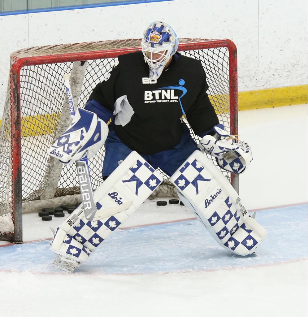
Guys are acutely aware of who has a cool mask, who designed what and they are very particular about these details.

The goaltenders do not pay to have their masks designed, the team does. There is no "convenience" by having Dave do their mask. They are not the person on the phone ordering the mask or arranging for the painting. All of that is handled by the equipment managers. They pick the mask the want, they select the artist they want, and the collaborate with that artist on the design.

Some guys are sending sources photos, sketches, detailed ideas and concepts to the artists doing their masks. Acting like these guys are passively involved in the process or don't care who the artist is or what's on their mask is totally and completely nonsense.

Sure, but what I am saying is artists have their own style and DaveArts style is clearly shown on his masks that are extremely over cluttered. Take the same details the goalie wants and go to say Hiller's mask designer and the result I could assure you would be different. The execution would be so much more aesthetically pleasing.

I work in graphic design it's the same thing in that field, every one has their own style some are good and some are bad, and a lot of clients aren't artists themselves, so they really don't know what the best execution is, this doesn't mean they don't care, it's more that they're ignorant to how a good design can be more effective.
 

biturbo19

Registered User
Jul 13, 2010
27,001
12,156
This is where you are wrong.

The goalies are making masks that are very personal to them. When these cage/mask combos first rose to prominence in the late 1980's, the primary artist was a guy called Greg Harrison. He very much operated with that MO. He made very stark, distinct, bold designs that were simple, yet clever and could be enjoyed from a great distance. He made a lot of use of white space and negative space and created several iconic goalie masks.

Greg got pushed out of the game because he refused to license the actual team logos, so he wasn't able to put logos on his masks (which is how he came up with designs like Belfour's Eagle mask or Hayward's shark mouth, or Moog's bear mouth.) He also wouldn't pay to license other logos or characters (think Budaj's Ned Flanders, for example) and as more and more goalies wanted personalized details and teal logos, Harrison got pushed out of the business altogether.

Goalies today - and for a long time now - have no interest in the mask looking cool on television, or from the crowd. It's a very personal piece of their equipment and its a way for them to add personal flare to their mask. They want to have their favourite bands, movies, family members whatever worked into a concept. The masks for them - for the vast majority of them - is something that looks cool in their hands and I can't tell you how many times I've had one of them show me a really cool, little almost hidden detail. It's the very opposite of what you are talking about that delights them.

Dave is giving them what they want, he's not forcing a personal aesthetic upon them. If he did, he'd be out of business. If that's what goalies wanted, they'd be going to Hillier's designer. But Hillier is the exception, not the rule.

People are free to not like Dave's designs, but pretending they are being forced upon the goalies is just ridiculous and screams of people trying to pretend that their opinion is fact.

The bolded is where this all falls apart. When the same LensFlareTrademarkGloFX "aesthetic" gets dumped out the other end of every process.

I mean, clearly there's a lot of blame to be placed on current goaltenders for retaining the services of one DaveArt for their masks. And at some point, it gains unbeatable marketing capability. The most popular thing is the most popular thing.

But that doesn't absolve goaltenders of having highly personalized over-detailed masks. I mean, the consequences for that are basically just some people whining about it on an internet forum so they don't give a hoot. :laugh: But, it doesn't make the designs good, artistically interesting, well-designed, or anything of the sort. And it's completely valid to complain about the plague DaveArt is upon the mask art of today's NHL. Because for me as a viewer of the art...i'm not in that goalies locker stall, it's basically just a cluttered mess of mementos that don't mean anything to me.


Sometimes as a goaltender, you ought to hire a more design-oriented mask artist...for the greater good. And in return, you will be rewarded...with an immortalized mask design.
 

Vipers31

Advanced Stagnostic
Aug 29, 2008
20,388
2,190
Cologne, Germany
Always find it interesting so many fans seem to love black/dark-base-coloured pads. Don't know if it's the goalie or fan in me, but I hate them. The only thing worse might be split-designs like Lack's, in my subjective opinion. It may be the boring standard, but white base with smaller coloured elements is just a way, way sharper look, to me.

Anderson's are pretty neat. My favourites from this thread (which needs to be more actual equipment and less discussion on what is to be considered good, creative and/or subjective - how about a seperate thread for DaveArt discussion?) are probably Binnington's (post 174). The color use on Talbot's I like as well, although I find the lines to be a bit dull.
 

And You Feel Shame

Registered User
Jul 31, 2007
2,246
425
This is where you are wrong.

I don't think you are disagreeing with me as much as pointing out some poor phrasing on my part. I'm not blaming DaveArt exclusively for the issues with the mask designs of today. That is shared between he and the clients.

But the point remains that the focus for these mask designs are the people on the ice, and not the true audience in the stands and at home, and that's a significant flaw in the overall designs.

Honestly, I'm fine with it - after all the goalie is the client. It simply makes me appreciate all the more the goalies who understand the value that design has beyond wanting to look cool for their teammates and opposition.
 

Hockeyfan2390

Registered User
Nov 19, 2010
9,191
6,684
Kansas City, MO
Carey Price hosting a young goalies fundraiser, looks like he's in the same setup as last year -

11887961_872378736180493_1389848124606053325_n.jpg

11755399_872378966180470_8794417811847829281_n.jpg

11855850_872378799513820_4382086050292957058_n.jpg

11904087_872379079513792_5073565792097408966_n.jpg
 
Last edited:

FerrisRox

"Wanna go, Prettyboy?"
Sep 17, 2003
20,753
13,976
Toronto, Ontario
I don't think you are disagreeing with me as much as pointing out some poor phrasing on my part. I'm not blaming DaveArt exclusively for the issues with the mask designs of today. That is shared between he and the clients.

What I am objecting to - and this is not just from you by any means, it's all over this thread - is people, in an effort to support their own opinions, pretending that the goalies are somehow 'forced' to use DaveArt or that they don't really care what's on the mask, or they are using Dave because he's convenient, etc.

All of that is utter and complete nonsense. The vast majority of the goalies are very involved with their mask design, love all of the little features and effects, the new techniques and love all the details.

People, of course, are entitled to their own opinions, but there are people in this thread that seem to think their opinion is a fact. There's even a guy in this thread that actually claimed that art isn't subjective. You, or anyone, can say that the masks are poorly designed. What I am saying is that from my experience, the goalies - the clients - love the designs and are getting exactly what they want.

I have seen, for a few years now, tons of people mocking DaveArt's mini logos, his lens flares, his detail, his GlowFX, etc. And again, people are free to not like that. Where they lose me - and where they stray from the actual facts - is when they try to pretend that this is somehow not something that the goalies themselves love. When Ben Bishop's glowing "Tron" mask came out, there were multiple NHL goalies that right away wanted that glow paint on their next mask. So people can say it's stupid, but that doesn't change the fact that the actual goalies really like that stuff and really like Dave's design work.

I've seen multiple people try to run down his design work - and even strangely offer their artistic credentials as if that somehow matters - but the fact of the matter is, the reason he is, by far, the most popular mask artist in the NHL is quite simple: the guys that wear the masks love his work.
 

FerrisRox

"Wanna go, Prettyboy?"
Sep 17, 2003
20,753
13,976
Toronto, Ontario
I
But the point remains that the focus for these mask designs are the people on the ice, and not the true audience in the stands and at home, and that's a significant flaw in the overall designs.

You seem to be confusing your opinion with fact.

*YOU* think the focus of the mask designs should be the "true audience in the stands and at home" but that's simply your opinion and you seem to be offering it up as a fact.

*YOU* think that's a significant flaw in the design. That's your opinion. The design is flawed *to you* because *you* think that it should be a design that works for the people in the crowd and watching on television. What I was telling you is that that is *not* what the goalies think and that is not the objective of DaveArt when he's creating these designs because that's not what his clients are requesting in anyway, in fact, they are very much requesting the opposite.

That's like me telling you that there is a significant flaw in your recipe for chocolate cake because I can't taste any cinnamon, which is the true measure of a great chocolate cake.
 

WeThreeKings

Demidov is a HAB
Sep 19, 2006
94,690
104,324
Halifax
I don't think Price will use the same set-up. I imagine we'll see something new at training camp. Price is notorious a mask/gear ****.
 

SladeWilson23

I keep my promises.
Sponsor
Nov 3, 2014
26,738
3,233
New Jersey
What I am objecting to - and this is not just from you by any means, it's all over this thread - is people, in an effort to support their own opinions, pretending that the goalies are somehow 'forced' to use DaveArt or that they don't really care what's on the mask, or they are using Dave because he's convenient, etc.

All of that is utter and complete nonsense. The vast majority of the goalies are very involved with their mask design, love all of the little features and effects, the new techniques and love all the details.

People, of course, are entitled to their own opinions, but there are people in this thread that seem to think their opinion is a fact. There's even a guy in this thread that actually claimed that art isn't subjective. You, or anyone, can say that the masks are poorly designed. What I am saying is that from my experience, the goalies - the clients - love the designs and are getting exactly what they want.

I have seen, for a few years now, tons of people mocking DaveArt's mini logos, his lens flares, his detail, his GlowFX, etc. And again, people are free to not like that. Where they lose me - and where they stray from the actual facts - is when they try to pretend that this is somehow not something that the goalies themselves love. When Ben Bishop's glowing "Tron" mask came out, there were multiple NHL goalies that right away wanted that glow paint on their next mask. So people can say it's stupid, but that doesn't change the fact that the actual goalies really like that stuff and really like Dave's design work.

I've seen multiple people try to run down his design work - and even strangely offer their artistic credentials as if that somehow matters - but the fact of the matter is, the reason he is, by far, the most popular mask artist in the NHL is quite simple: the guys that wear the masks love his work.

You seem to be confusing your opinion with fact.

*YOU* think the focus of the mask designs should be the "true audience in the stands and at home" but that's simply your opinion and you seem to be offering it up as a fact.

*YOU* think that's a significant flaw in the design. That's your opinion. The design is flawed *to you* because *you* think that it should be a design that works for the people in the crowd and watching on television. What I was telling you is that that is *not* what the goalies think and that is not the objective of DaveArt when he's creating these designs because that's not what his clients are requesting in anyway, in fact, they are very much requesting the opposite.

That's like me telling you that there is a significant flaw in your recipe for chocolate cake because I can't taste any cinnamon, which is the true measure of a great chocolate cake.

Both of these posts hit the nail on the head.
 

slocal

Dude...what?
May 4, 2010
16,161
7,127
Central Coast CA


Pretty boring, IMO but at least its not busy. Glad to see its not #daveart #cradleofcreativity #glowtechfx though. I was hoping Hiller's original artist would have gotten the job, but that was just my dream.


I think it'll look much more snazzy once the gloss coat is on there. I like the subtle silhouettes in the white spaces and can't wait to see the other side of his mask. I do hope the original Sharks logo is in there somewhere. After all, it is a tribute mask.

I'm also wondering if he'll be using this one all season. Seems more team-oriented than most masks. Then again, he may not be a flashy kind of guy.
 

The Nuge

Some say…
Jan 26, 2011
27,958
9,151
British Columbia
Always find it interesting so many fans seem to love black/dark-base-coloured pads. Don't know if it's the goalie or fan in me, but I hate them. The only thing worse might be split-designs like Lack's, in my subjective opinion. It may be the boring standard, but white base with smaller coloured elements is just a way, way sharper look, to me.

Anderson's are pretty neat. My favourites from this thread (which needs to be more actual equipment and less discussion on what is to be considered good, creative and/or subjective - how about a seperate thread for DaveArt discussion?) are probably Binnington's (post 174). The color use on Talbot's I like as well, although I find the lines to be a bit dull.

See, the goalie/fan in me hates white :laugh:. It's too boring. I've still got the Fleury yellow Reebok's. Subban's gear from last year is about as good as it gets imo. To me, the key is conference. Imo, goalies should wear whatever they like, and ignore the people who say otherwise

Here's Subban's take

https://www.bostonglobe.com/sports/...ve-him-edge/DmL8mdjiTKrmBIu5aRrEEN/story.html
 

Hockeyfan2390

Registered User
Nov 19, 2010
9,191
6,684
Kansas City, MO
Apparently Brian Elliott is channeling his inner Johan Hedberg.

11873516_10153540017949819_5762759751252825557_n.jpg


"We are very happy to welcome Brian Elliott to our team! Very soon we will present Brian's latest St Louis Blues mask creations, a series of mask adventures with the Moose Whisperer... here comes some sneakpeeks from Brian and me ‪#‎brianelliott‬ @kidells1 @stlouisblues @nhl ‪#‎daveartthecradleofcreativity‬ ‪#‎nhl‬ @davidofdaveart ‪#‎daveart‬"
 
Status
Not open for further replies.

Ad

Upcoming events

Ad

Ad