Tribute Need opinion on logo mockup as part of MA Project

  • Xenforo Cloud will be upgrading us to version 2.3.5 on March 3rd at 12 AM GMT. This version has increased stability and fixes several bugs. We expect downtime for the duration of the update. The admin team will continue to work on existing issues, templates and upgrade all necessary available addons to minimize impact of this new version. Click Here for Updates

Shawklan27

Registered User
May 25, 2022
3
1
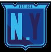
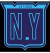
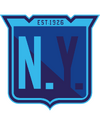
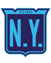
I want the logos to be presented under a "manhattan" word script akin to what buffalo did with their reebok wordmark jersey from before. I haven't thought of the jersey designs yet so I went ahead and made these logo variations of the rangers. Which one of these ones works the best? This is apart of my project to make a city jersey for each nhl team akin to what the mlb and nba and doing with some of their teams. Any and all feedback would be greatly appreciated thanks!
 

Attachments

  • IMG-20220525-WA0000.jpg
    IMG-20220525-WA0000.jpg
    48.2 KB · Views: 14
  • IMG-20220525-WA0001.jpg
    IMG-20220525-WA0001.jpg
    58.2 KB · Views: 12
  • Untitled-1asq.png
    Untitled-1asq.png
    110 KB · Views: 12
  • Untitled-1Dss.png
    Untitled-1Dss.png
    104.2 KB · Views: 14
Two dots or zero dots.

One dot is a no-no. Love everything else about this though! Nice colors and all.
 
  • Like
Reactions: themilosh
I like the 2nd and the last one. They are clearly legible and the right parts of what you want to see are visible
 

Ad

Upcoming events

Ad