Logo Tournament - New York Islanders vs. Seattle Kraken

  • Work is still on-going to rebuild the site styling and features. Please report any issues you may experience so we can look into it. Click Here for Updates

Which logo do you like more?


  • Total voters
    172

GFS

Registered User
Apr 12, 2010
3,009
276
Which logo do you like more?

3911_new_york_islanders-primary-2018.png
seattle_kraken_logo_primary_20226314.png


R32R16QFSFSCFSFQFR16R32
CHI 106
STL 92

ANA 9
ARI 96

CGY 124
LAK 21

BOS 95
VAN 37

NYI
SEA

PHI
VGK

WPG
EDM

DET
SJS
CHI
ARI

CGY
BOS

TBD
TBD

TBD
TBD
TBD
TBD

TBD
TBD
TBD
TBD
TBD
TBD
TBD
TBD
TBD
TBD

TBD
TBD
TBD
TBD

TBD
TBD

TBD
TBD

TBD
TBD
TOR
FLA

BUF
CAR

MIN
NSH

NYR
TBL

NJD
DAL

PIT
CBJ

OTT
COL

MTL
WSH
 
I never understood what the orange Bloch in the middle of the islanders logo is suppose to be.
 
I never understood what the orange Bloch in the middle of the islanders logo is suppose to be.
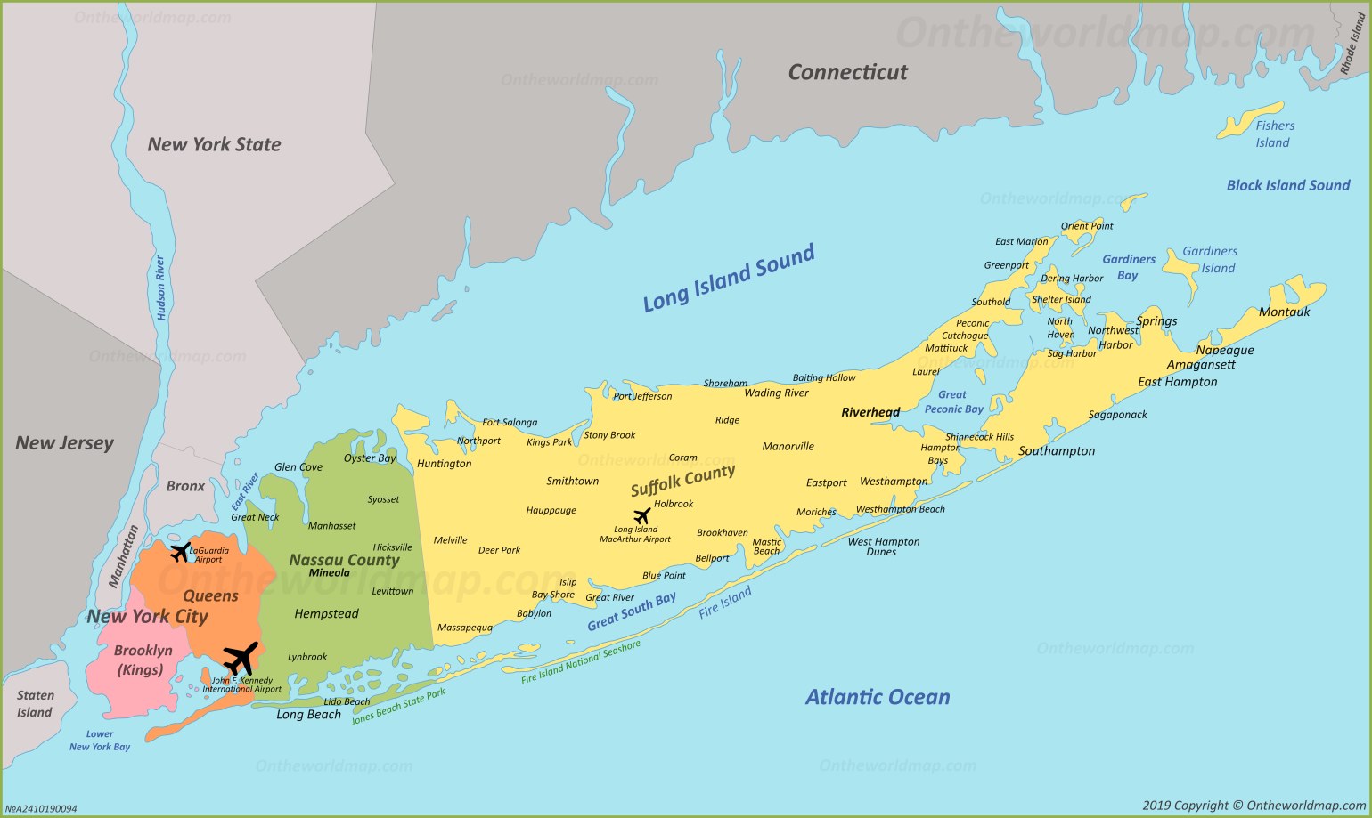
That’s Long Island. The blue inverted part of it by the “I” is where Nassau Coliseum is, although this might actually be their updated one where Barclays Center is because that west-most part of it looks a lot like Brooklyn. I’m also unsure if they came out with a yet more updated logo with it pointed towards UBS Arena.

The four stripes on the stick also represents their four cups.

The Isles logo is superior in every way.
 
Last edited:
  • Like
Reactions: sebsisles and Green
The logo, jerseys, and overall look for Seattle is fantastic. It's the thing they got the most right when they joined the league.

The Islanders logo is an oldie and a goodie. It carries some nostalgia and history. But the Kraken logo is better looking, sharper, more interesting, and has a way more unique colour scheme.

Kraken.
 
  • Like
Reactions: jetsforever
The Kraken logo might be "better" in some respects, but it just feels so edgy teenager to me. Like it takes itself too seriously.

But the Isles logo, nostalgia aside...is actually a bit ugly and weird. Still lean toward NYI logo here.
 
Both good logos but prefer the Islanders. The Kraken logo is good and has the right idea but I think the execution could have been better. I have to say, I really like the Kraken alternate logo as someone who loves towers and skyscrapers. I think it is simple yet brilliant.
 
I went with the Islanders, I like Seattles logo, but think their white jersey may be the worst on the league.
 
That’s Long Island. The blue inverted part of it by the “I” is where Nassau Coliseum is, although this might actually be their updated one where Barclays Center is because that west-most part of it looks a lot like Brooklyn. I’m also unsure if they came out with a yet more updated logo with it pointed towards UBS Arena.

The four stripes on the stick also represents their four cups.

The Isles logo is superior in every way.

Brooklyn and Queens are not on the logo at all. It’s never pointed to anywhere other than Uniondale.

Look at the ‘fingers’ on the top of Nassau and it’s easy to tell:

map-of-long-island.jpg
 
Brooklyn and Queens are not on the logo at all. It’s never pointed to anywhere other than Uniondale.

Look at the ‘fingers’ on the top of Nassau and it’s easy to tell:

map-of-long-island.jpg
I stand corrected. But still, there’s I think a lot more detail in their logo that a lot of people don’t realize.
 
Feels like Isles are kind of just grandfathered into this one. I’m more of the school that logos should be something a kid can draw on their notebook or even adults can easily tattoo it. Long Island is not an easy thing to draw and that part just doesn’t do it for me as a logo. Kraken maybe leaned a little too far into cartoony but it’s a solid logo and I think better than NYI.
 

Ad

Upcoming events

Ad