Le Rosbeef
Registered User
- Jul 27, 2007
- 3,554
- 1,323
Did they ever say what the B stands for?
Boondoggle.
Did they ever say what the B stands for?
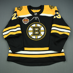
This year and next years first, they signed right upNice, reminds me of their great 80's-90s logo.
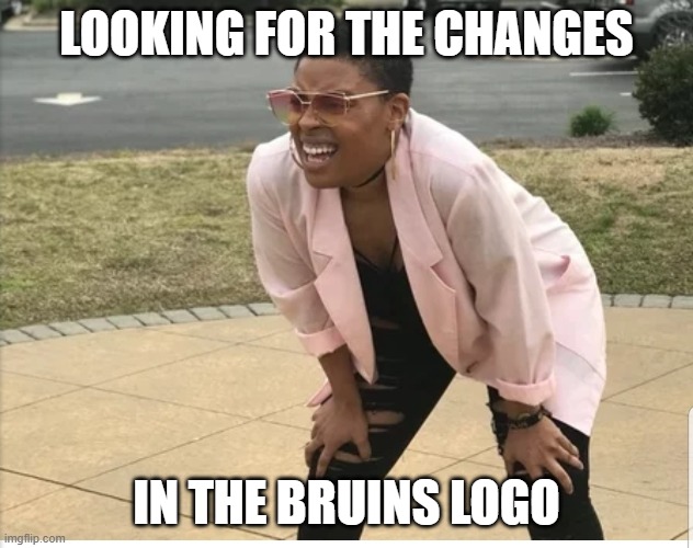
Yep, some posters are blind by their hatred. Lol...Are y’all serious?
View attachment 1054257
View attachment 1054258
You legitimately can’t see the differences between the top and bottom?
Don Sweeney and Cam Neely: "Behold the unveiling of our new logo!"
Bruins fans: "How does this help us win?"
Don/Cam: "Win?"
Yeah, or could gone with the Pooh bear logo,Meth bear is fun and all but Pooh bear is king and I'd sell Pastrnak away for free if it meant pooh bear back full time
View attachment 1054200

Jersey sales will increase with something new...I already know a Bruins fan who said he wants to get the new jersey lolBut...why?
1995-2007 was already the best. Why the need to unnecessarily change the logo like this?
Looks nothing like the recent jerseys.Management to PR- “ guys can you help distract the fans from our incompetence by releasing a new logo? Just make sure it looks almost identical to the previous one.
Nice, reminds me of their great 80's-90s logo.