
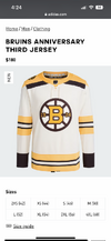
Bruins 100th anniversary jerseys
- Thread starter KrugAvoy
- Start date


MMC
Global Moderator
Sniperberg
Registered User
- Mar 30, 2017
- 702
- 1,571
HTFN
Registered User
- Feb 8, 2009
- 12,247
- 11,978
They look like, to truly honor the past, they gave up on dyes of the future and made all the yellow with tobacco spit.
AtlantaWhaler
Thrash/Preds/Sabres
- Jul 3, 2009
- 19,574
- 4,241
Needs more stripes

JohanFranzenstein
Registered User
- Dec 6, 2013
- 2,234
- 4,462
dirtydanglez
Registered User
- Oct 30, 2022
- 4,496
- 6,406
Rob Brown
Way She Goes
- Dec 17, 2009
- 16,759
- 14,830
I like the third, but the home and away are pretty meh. Too many stripes on the arms as well.
Bakayoko Ono
Registered User
MarkusKetterer
Shoulda got one game in
John Mandalorian
2022 Avs: The First Dance
- Nov 29, 2018
- 10,643
- 8,498
And people thought they were an old team last year! [rim shot]
Thank you and good night!


Thank you and good night!
jetsforever
Registered User
- Dec 14, 2013
- 27,325
- 25,913
BigBadBruins7708
Registered User
Horrible and disappointing.
Just give us the late 80s sweaters with a centennial patch slapped on it...
Just give us the late 80s sweaters with a centennial patch slapped on it...
Barnum
Registered User
Doesn’t look as stripie on the players with their equipment on.
:quality(70)/cloudfront-us-east-1.images.arcpublishing.com/cmg/LQAZIOKNAZF27GZJZGVIC2263I.png)
 www.boston25news.com
Boston Bruins reveal new jerseys for 100-year anniversary
As the Boston Bruins become only the third club to celebrate their 100th NHL season, they'll be dressed for the occasion.
www.boston25news.com
Boston Bruins 200th anniversary jerseys:

calorie content on this?
and why only one slice of cheese on the bottom bun?
tarheelhockey
Offside Review Specialist
This is what happens when you over-do retro and special event jerseys, so there’s nothing to do but roll out different stripe combos.
DaveG
Noted Jerk
Bouboumaster
Registered User
- Jul 4, 2014
- 9,671
- 11,053
3rd Jersey is ok, but home and away are for fugly
Way too many stripes and I don't like the color tone
Way too many stripes and I don't like the color tone
kvladimir
Registered User
- Dec 1, 2010
- 707
- 926
I think overall, this is a very good and very nostalgic look with some tweaks. Yes, the striping on the home/away is a little odd, but not a killer.
It's important to keep the context of "this is for 1 season to celebrate an anniversary only" in mind. Otherwise, something like changing their yellow-gold to this duller, more metallic gold would be outrageous, but for a 1-season anniversary celebration? I think that's pretty cool...
It's important to keep the context of "this is for 1 season to celebrate an anniversary only" in mind. Otherwise, something like changing their yellow-gold to this duller, more metallic gold would be outrageous, but for a 1-season anniversary celebration? I think that's pretty cool...
The Hockey Tonk Man
Registered User
Yeah, thirds slick and has a classic lookI like the third, but the home and away are pretty meh. Too many stripes on the arms as well.
Way too many stripes on the others
Could look nice in game tho
Users who are viewing this thread
Total: 1 (members: 0, guests: 1)